Excel General Trade is a brand-new multination trading company. I was comissioned to design the company's identity.
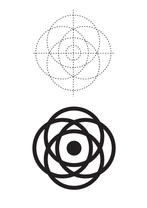
Main operations are located in Bulgaria. My main inspiration came from corporate logos and the rose-which is abundant in the neighbouring country. The circle in the center represents the world ("global") and the rest of the concentric circles form plane-like paths or orbits ("general trade"). I also wanted the company to have a strong and clean, memorable image and tried to avoid gradients and overlays.
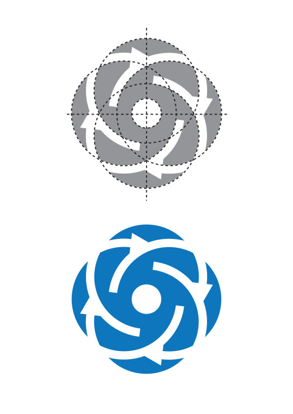
So, I started by designing four concentric circles around the center (the four points of the horizon). At this stage however, the image of the rose is not quite clear.
Main operations are located in Bulgaria. My main inspiration came from corporate logos and the rose-which is abundant in the neighbouring country. The circle in the center represents the world ("global") and the rest of the concentric circles form plane-like paths or orbits ("general trade"). I also wanted the company to have a strong and clean, memorable image and tried to avoid gradients and overlays.
So, I started by designing four concentric circles around the center (the four points of the horizon). At this stage however, the image of the rose is not quite clear.
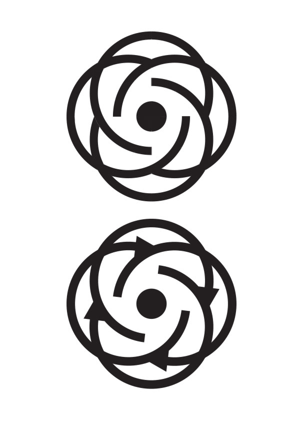
So, using the pathfinder tool in illustrator I cleared a few lines and the image became much more appealing to my eye. To further enhance the dynamic values of the shape, I added arrowheads indicating left-to-right rotation (forward thinking, constant evolution, travel).
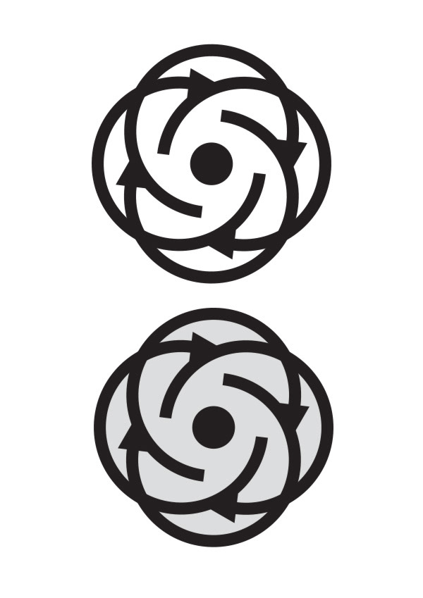
I then filled the white shapes with a light gray colour and the shape became much more interesting.
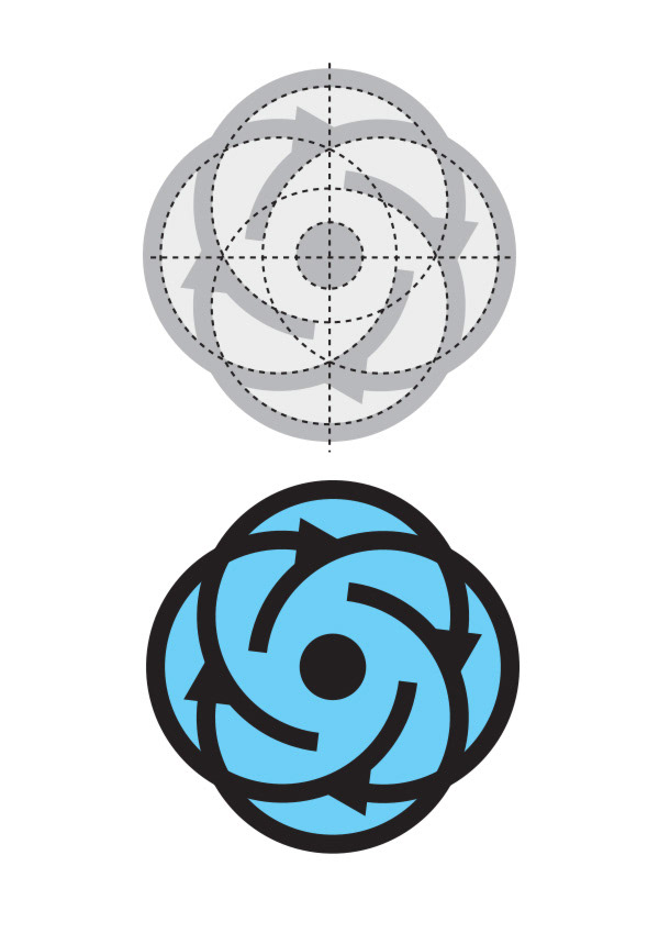
I swapped the interior gray with a 50% Cyan swatch. The company has strong corporate relations with Greece and since Greece is associated with the aegean, the islands, the sea and generally "blue" images (yes, it is a stereotypical point of view...) I found this particular contrast satisfactory.
I pushed it a bit further, deleted the black lines and created a short of "negative". However I had to choose a more powerful colour. Pantone 285 C, that is...
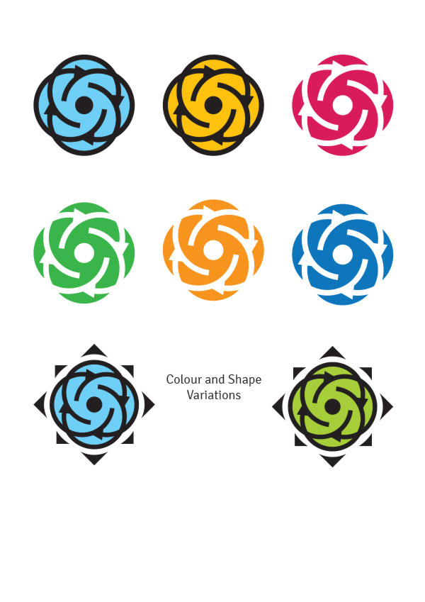
I created more colour variations and toyed a bit with the idea of the compass.
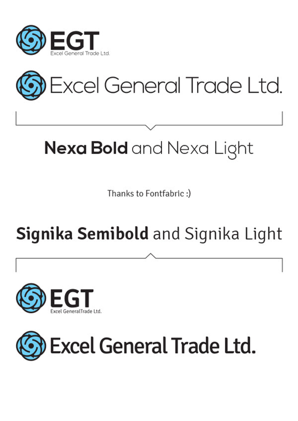
These two excellent font from Fontfabric were an instant typography solution for me.
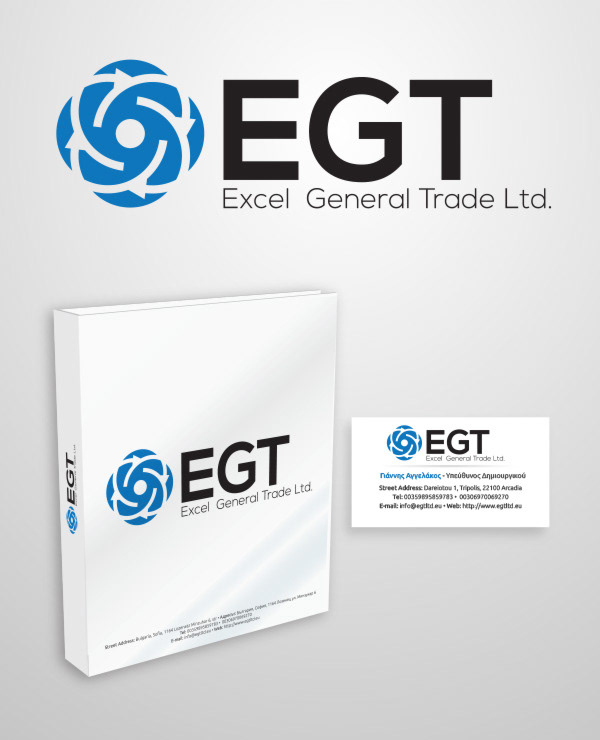
The final logo chosen by the client, a Folder 3D mockup and a business card.
Thanks for watching
Thanks for watching