c) The overall design should be as fresh as possible without becoming too fancy or hip. The target group is mainly women of all ages (with the exclusion of athletes which are a minority). It is a cosmetic product, but not medicine.
d) Legibility, legibility and legibility.The vase's diameter is roughly 5cm. So the typography had to fit in a really small space. I opted for modern, clean type and bold lettering.
d) Legibility, legibility and legibility.The vase's diameter is roughly 5cm. So the typography had to fit in a really small space. I opted for modern, clean type and bold lettering.
At the first stages of the design, I decided to immitate the pen and ink illustration look, using Adobe illustrator's scrollpen brushes. As the project followed I kept the technique but with variations on each label. The colours on each label would be a combination of the ingredients and light yellow for the background.
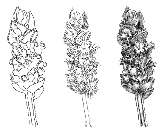
Lavender. Outlines and shading skeleton.

Lavender. Close-up view
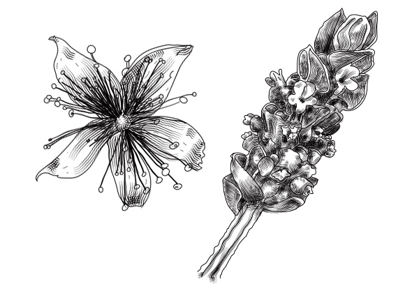
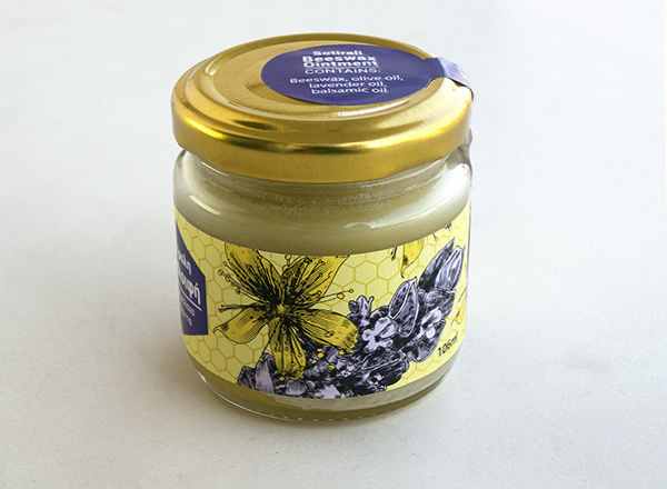
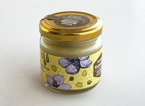
Lavender and Balm flower

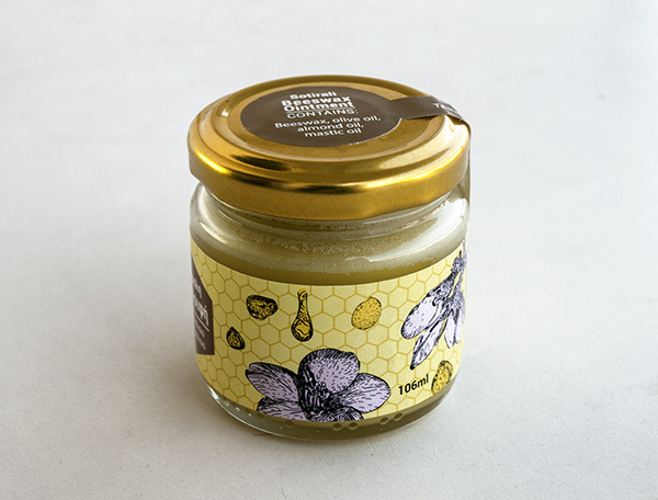
Almond Flowers and mastic drops

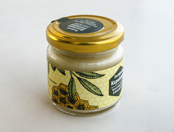
Honeycomb and olive leaf with olive fruit.
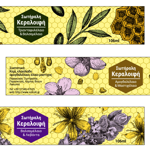
Finished labels close-up
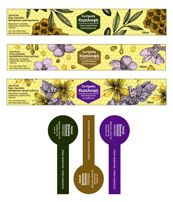
Finished labels and die cut moulds for the security tape.
Below: photos of the finished product