The Design Brief
During 2012, I was assigned by Sotirali Bio (a biological oil and honey products in Greece) to redesign their mead (honey wine) bottle labels. The redesign was essential at that point because their label was really aging and was not well received by customers. It used photos and Byzantine-style lettering which also made the label difficult to read, expensive to print and cheap looking.
On the other hand, their product is of trully high quality and exceptional taste. The only element that was required to remain unchanged was the old castle of Aghia Paraskevi, located in Mesochori of Neapolis, Laconia, Greece and regarded as a local landmark.
A final requirement set from the client was for the label to have a "traditional" look and that I shouldn't move towards a more edgy approach.
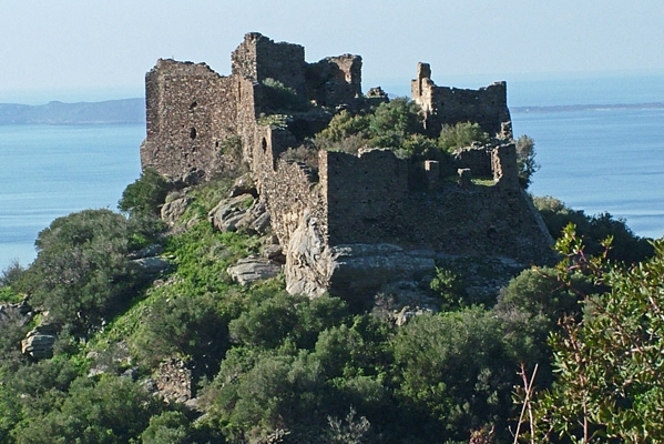
My first reaction to the brief, was to go out and take photos of the castle. This is not the exact photo that I used, but you get the picture.
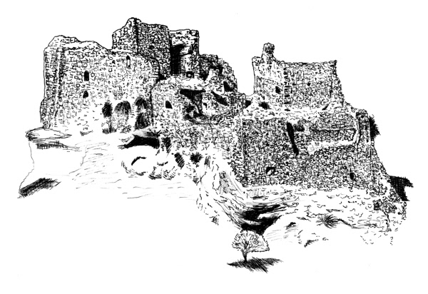
Since I decided to get rid of the photos but on the same time keep the castle as a design element, I made this sketch of the castle using a fine pen...
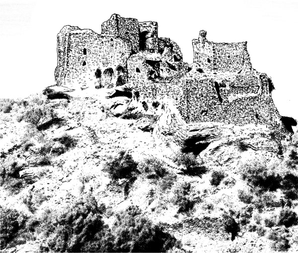
...then added the rest of the more complex (and less important) environment details using "Fotosketcher", a fantastic freeware convert-to-sketch program and finally...
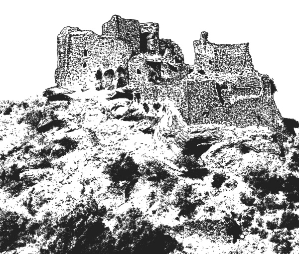
...converted the image from bitmap to vector using illustrator.
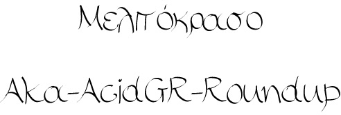
I wanted the words "Mead" (Melitokraso in Greek) to have a sort of liquid and sweet look. This brush script font by Aka-Acid seemed promising, but I had to make it look bolder and subsequently adjust the kerning.
After some experimentation and print test, I came up to this solution. Note that the actual label is smaller than what you actually see here, so the lettering had to look really bold.
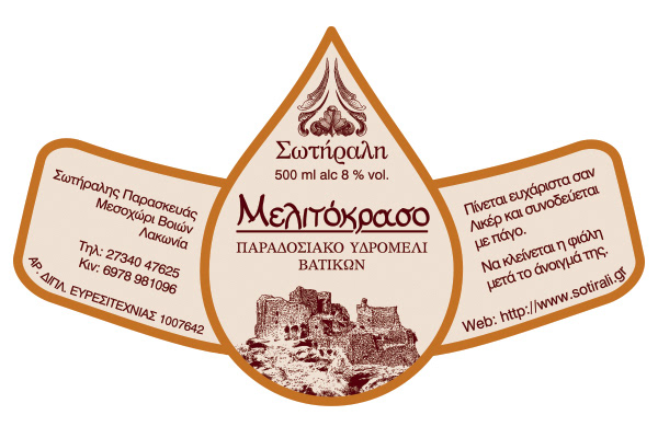
The final 500ml bottle label design.
Now, there is an interesting story about the peculiar shape of the label. The bottle that my client has selected is of a teardrop or flask shaped design. Since the solutions of direct printing or plastic sleeved were ruled out, I had to design a label that would be made of just self-adhesive paper. Additionally, i had to put ALL of the required information on a single label, since there was no option for a back-front solution.
After many shape and size tests I found out that this particular shape could fit all of the information and stick nicely on the bottle with no paper crumbling.
(see photos of products below the labels).
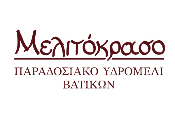
I used colors that created a high contrast between the label and the product itself, without losing the honey-related tones.
Now, there is an interesting story about the peculiar shape of the label. The bottle that my client has selected is of a teardrop or flask shaped design. Since the solutions of direct printing or plastic sleeved were ruled out, I had to design a label that would be made of just self-adhesive paper. Additionally, i had to put ALL of the required information on a single label, since there was no option for a back-front solution.
After many shape and size tests I found out that this particular shape could fit all of the information and stick nicely on the bottle with no paper crumbling.
(see photos of products below the labels).
I used colors that created a high contrast between the label and the product itself, without losing the honey-related tones.
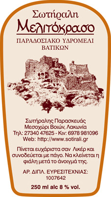
The final 350ml bottle design.
A much easier case. This time the bottle sides are almost flat and the shape was easy to come-up with.
A much easier case. This time the bottle sides are almost flat and the shape was easy to come-up with.

Photo of the 500ml bottle. The tonal range that the mead produces is spectacular-especially if the light's angle is right!
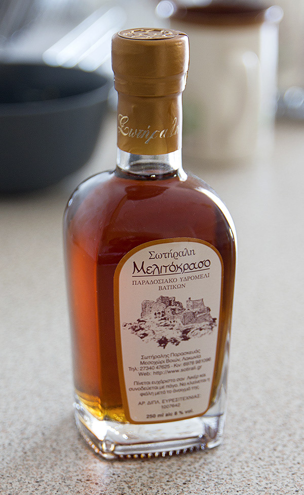
The rectangular shaped 250ml bottle.
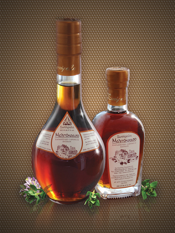
Packshot suggestion
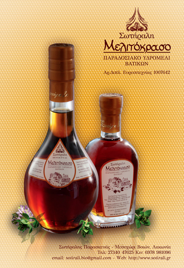
Promotional poster design
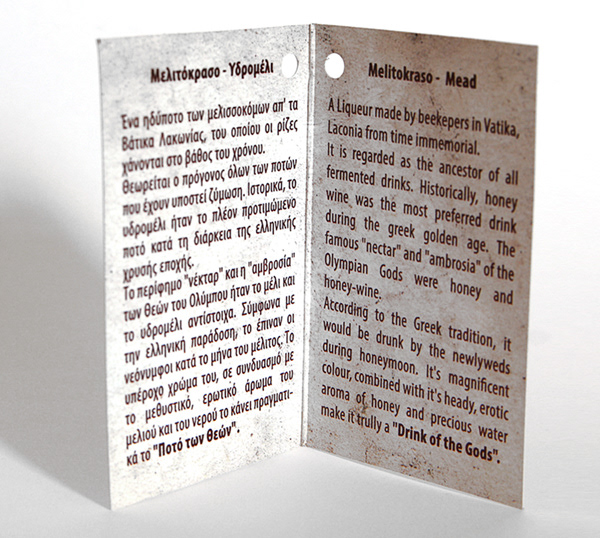
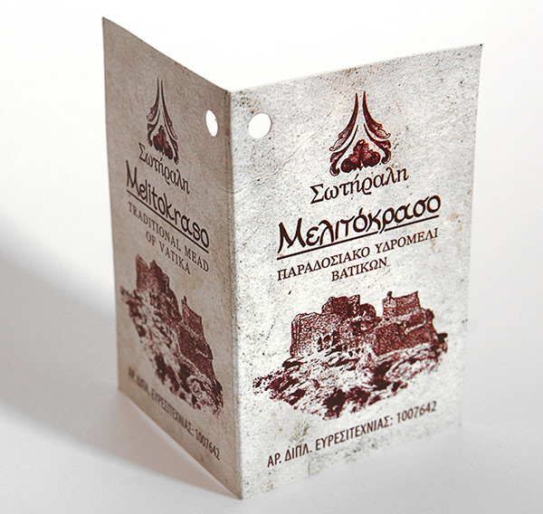
The tiny leaflet that is strung around the bottle's neck.
All Photos and graphics, Copyright © 2011-2013 Yannis Aggelakos